 We first set out to create a landscape film poster as we found this the most unusual film poster layout, however we decided it did not accommodate our ideas well, it ended up looking crowded if we added more people to the photo yet it looked empty when we used fewer people. We then reverted back to the examples of film posters used in the questionnaire and we looked at the opinions of the respondents. From this we determined that our poster would benefit more from the techniques used in the Hot Fuzz poster as it was intriguing and it better suited our subject. We then wanted to add to the intrigue element so we decided to only take photos of a door and a guitar. This makes the mockumentary look more realistic as the poster looks like a general music poster which would be used in pubs and clubs. The black background is reminiscent of the Hot Fuzz poster, again adding to the mystery, yet it is also reminiscent of colours used in alternative music posters and album covers which is the genre we are focusing on. We both created rough drafts for the film poster, we then decided what kind of poster to create and I created the final film poster drafts and the final film poster.
IMPROVEMENTS
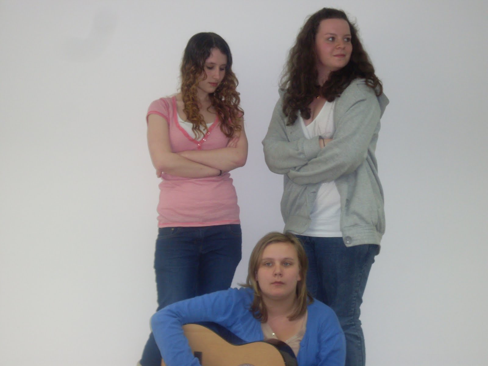
Once I got my grade I decided to improve on my poster and review, I took some photos of the people involved in the filming and I tried to make it more like the original drafts as I had more time and resources available than at the original time of making the poster and review. I took photos of the girl band and of the boy and girl who fight in the film which illustrates their relationship in the film and conveys conflict which captures the interest of people who view the poster. It also helps to target an audience of teenagers and both male and female as it portrays both genders and people of that age whereas my previous poster probably only appealed to males. I avoided using direct mode of address as I wanted the poster and review to be unusual and to demonstrate that the film was unconventional, however using people still attracts attention even though you aren't drawn by their gaze as it contains human interest whereas the image of the guitar does not. I also changed the font as I thought it worked better with the image than the previous font, I kept to a colour scheme as well to make the review, poster and images look connected and stand out.

 |
| Improved Images - Photos of the actors |
 |
| Improved Poster |


 |
| This is the original photograph that we took, we only took one photograph as the camera was running out of charge. |
 |
| Final Film Poster Drafts 1-3 |
 |
| The Final Poster |
No comments:
Post a Comment