We researched different review styles online and in magazines, we decided to design ours as if it was a magazine review. We decided to do a magazine style review as we thought this was the most effective and we have experience in creating magazines from previous media coursework. We drafted many layouts to see which would work best and ended up with a simplistic layout in which we have a large image at the top with columns below, we will also integrate quotes onto the page. The name of the film will be placed at the top of the page so the reader is drawn to the review and it advertises the film whilst people flick through the magazine. Below this will be a large main image with a caption placed, conventionally, at the bottom corner of the image. There will be a box containing important information and facts about the film (such as running time, rating and genre) therefore the important facts about the film are handy to find and it will help the reader decide if they would enjoy the film or not without necessarily having to read the review. The main body of text is placed below the film title, info box and image, the conventional column structure will be used and quotes will be added in the centre of the body of text to break it up and look less daunting for the reader to read, not only will this quote attract readers by breaking the text up but it will also stand out and catch readers eyes as it will be a bold colour and in a large font.
IMPROVEMENTS
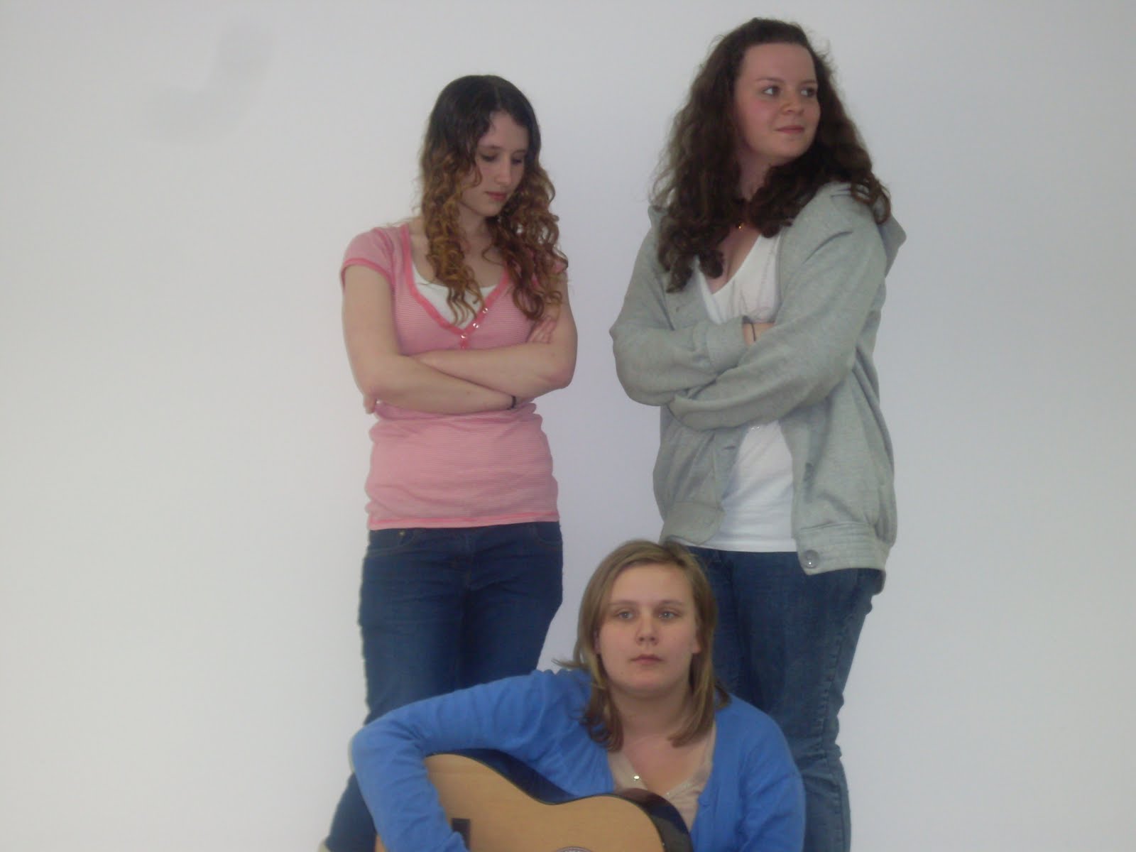
After getting my grade back I decided to improve both the poster and the review. When we first did the coursework I created the poster and Vikki created the review but this time I improved on both the review and poster, I decided to make the review and poster have similar colour schemes and images as it makes them look more connected and relates to the film better. I also took photos of the actors for the review as the still we used previously was bad quality due to the light when we were filming. The photos also hint to a lot of the plot lines in the film which will entice the audience and fit with the review, which I also improved upon. I looked back at my draft for the review and tried to keep it as near to that as possible, I also used more photos as they include both males and females, this attracts both females and males of that age whereas the last review which only included a still of the girl group may have only attracted females. On the poster I used a colour scheme which related to the photos, I have done the same on the review as it not only relates to the photos but it also relates to the poster and to the film which makes easily identifiable for any readers or audience.


 |
| Improved Photos |
 |
| Improved Review |


 |
| Final Drafts |
 |
| Final Film Review |


 |
| Stills from the film we considered for the review |